Smarteeva Admin Portal
Enterprise UX • SaaS Platform • Dashboard Design
A complete end-to-end redesign of Smarteeva’s internal Admin Portal — including dashboards, data tables, notifications, billing, user management, MDR search, and foundational UI patterns. The new design system streamlined daily operations, reduced navigation steps, and established a scalable enterprise interface for future AI-driven tools.

Project Overview
Over several years, Smarteeva’s Admin Portal had grown into a fragmented system. Each module was built in isolation — resulting in inconsistent layouts, mismatched patterns, and high cognitive load for internal teams.
As the platform expanded with new AI and automation tools, the admin environment needed a unified, modern, enterprise-grade foundation.
I redesigned the entire Admin Portal:
Consolidated navigation & information architecture
Standardized tables, cards, spacing, and typography
Created high-clarity dashboards with actionable analytics
Improved performance and reduced visual overload
Established a reusable internal design system
Modernized all utility pages (login, errors, profile, notifications)
The redesign created a coherent experience across 60+ screens and enabled teams to operate faster with far more clarity.
The Problem
❌ Before the Redesign
No consistent visual language across modules
Each feature had its own layout + UI patterns
Table-heavy pages lacked hierarchy and clarity
Multilevel navigation buried important workflows
Dashboard provided little actionable insight
Poor mobile responsiveness
High reliance on tribal knowledge to use the system
❗ Core Pain Points
Hard onboarding for new internal staff
Repetitive steps for simple admin actions
Unpredictable UI behavior across screens
Data was difficult to scan or compare
Important actions buried behind modals
❗ Business Impact
Slower operations & higher task time
More support tickets from internal users
Increased training overhead
Inefficient visibility for QA, support, implementation teams
Users / Audience
Implementation specialists
Customer support teams
Admin users
Billing & finance
QA & compliance teams
Product & engineering leads
User Needs
Clear overview of platform activity
Predictable navigation across modules
Faster access to key data tables
Trustworthy data presentation
Enterprise-level visual consistency
Goals
Improve clarity & hierarchy across all modules
Establish a unified design system for internal tools
Reduce cognitive load in table-heavy workflows
Increase admin efficiency by 40–50%
Set foundation for future AI/automation tools
Architecture Overview
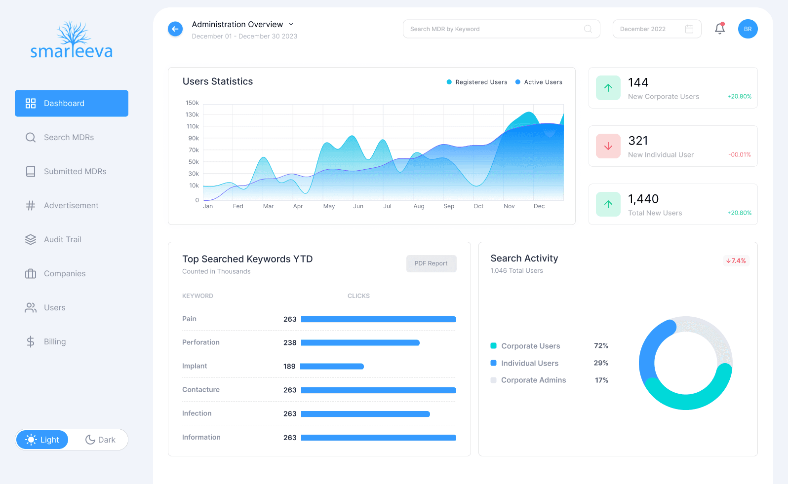
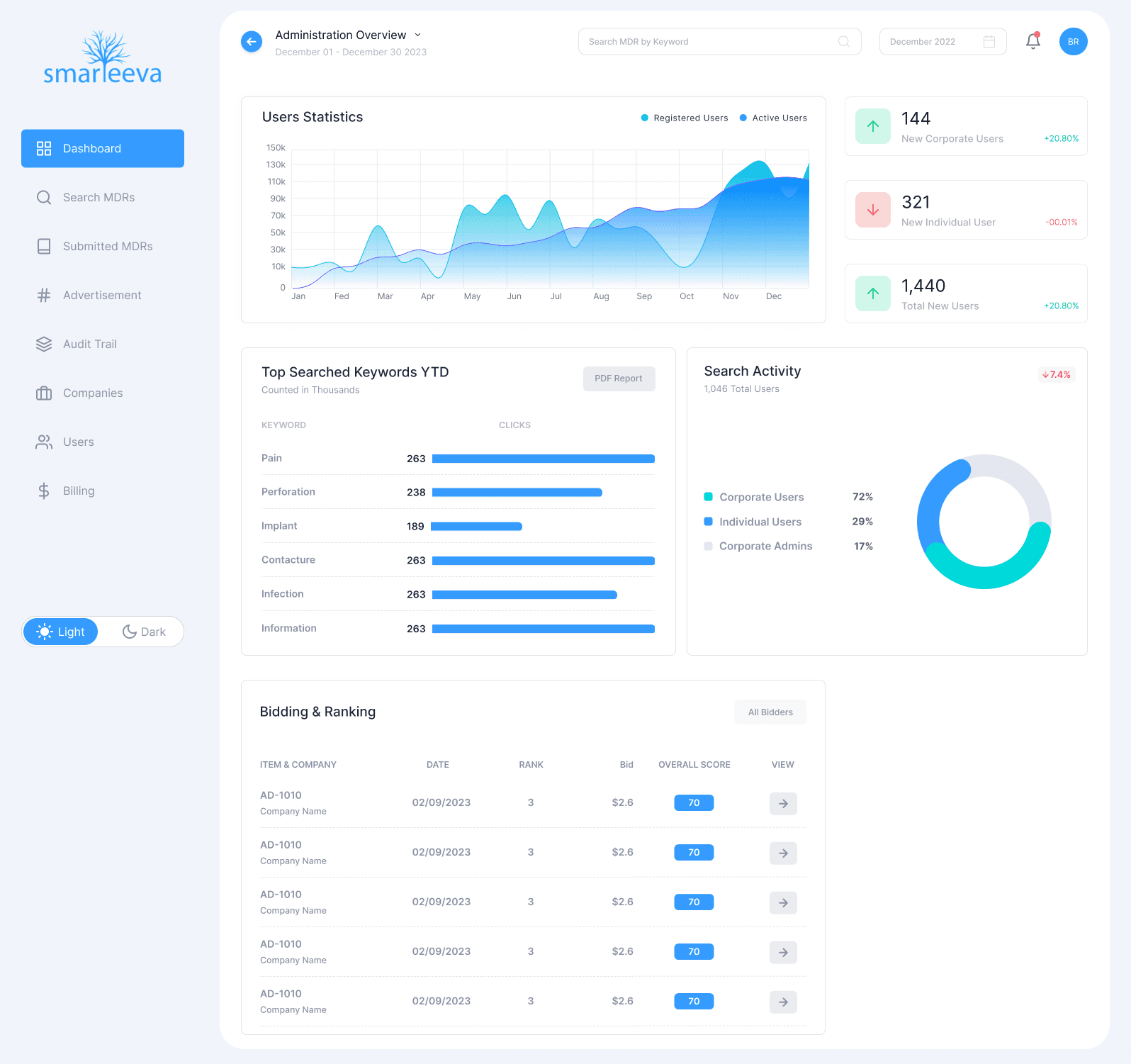
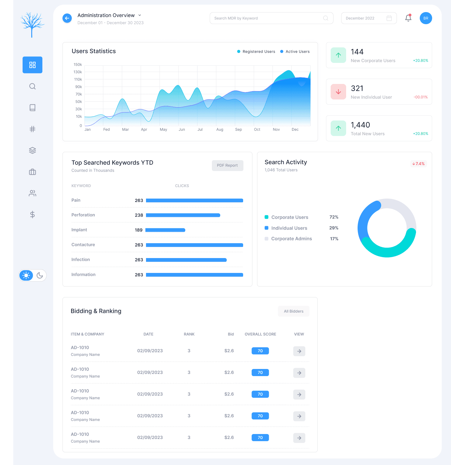
1. Dashboard Redesign
High-level platform analytics
Keyword distribution & search trends
User activity snapshots
Complaint & MDR insights
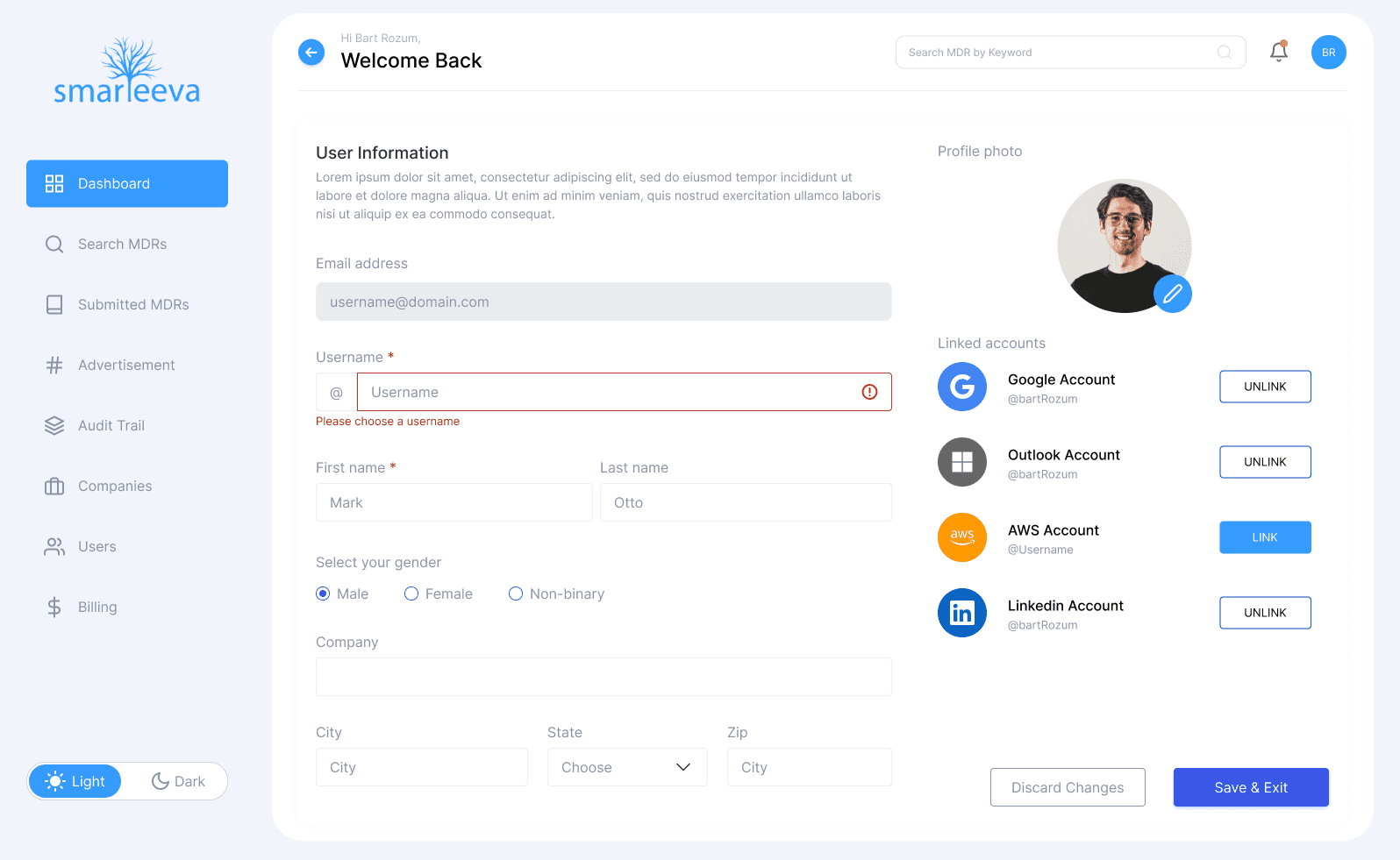
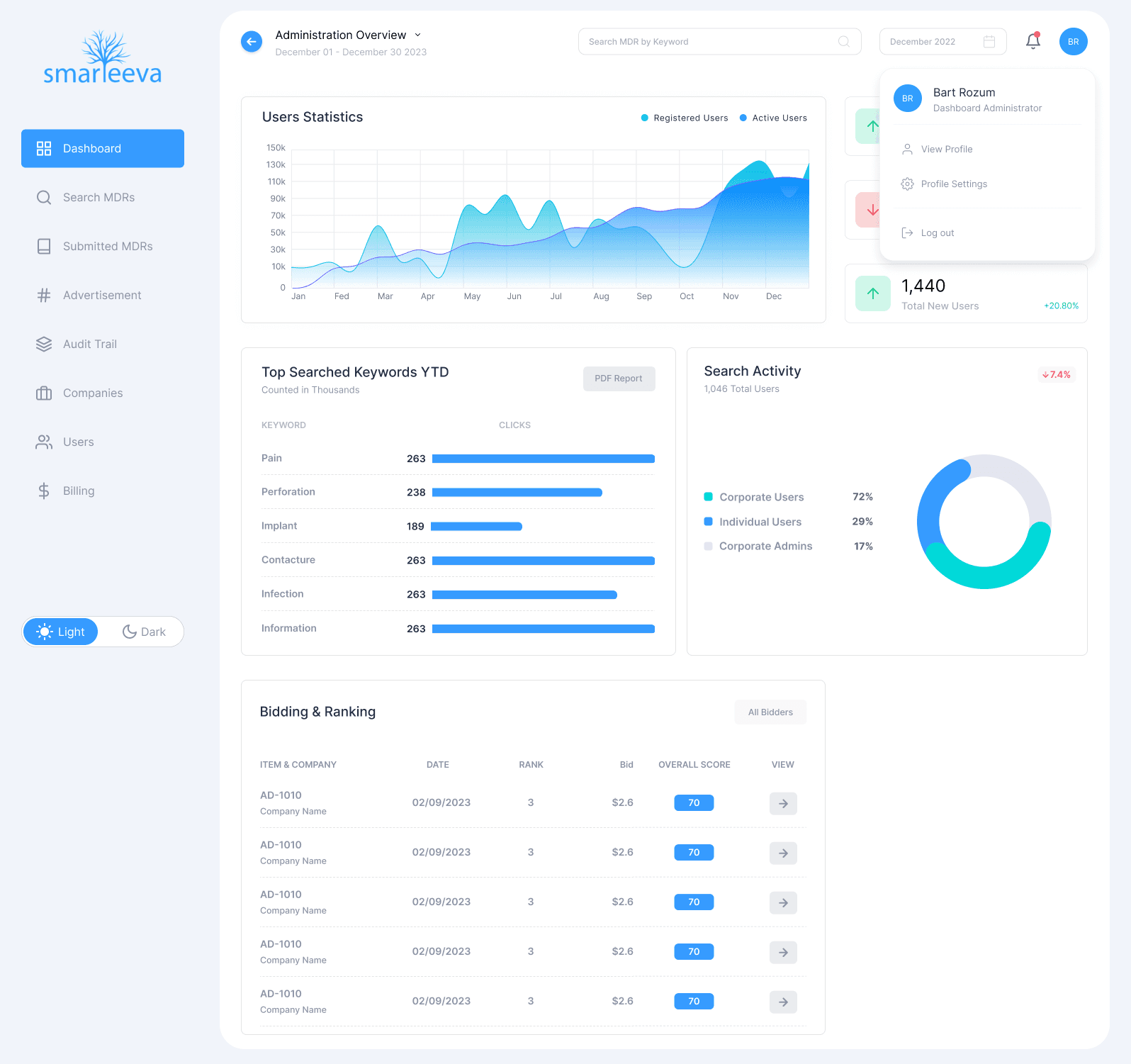
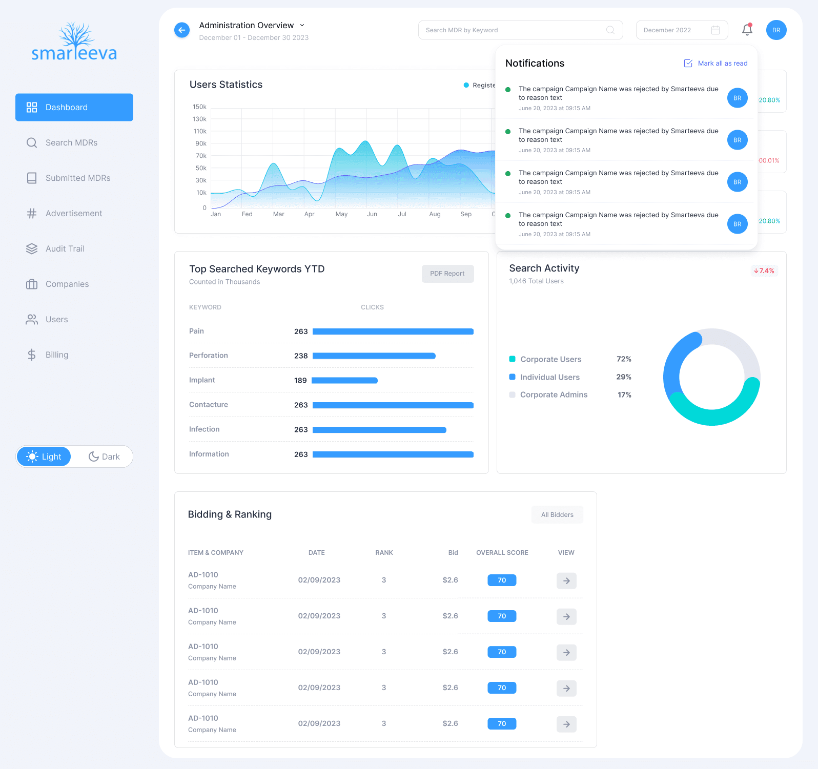
2. Notifications + Profile Menu
Real-time notifications
Quick-access profile settings
Reduced header complexity
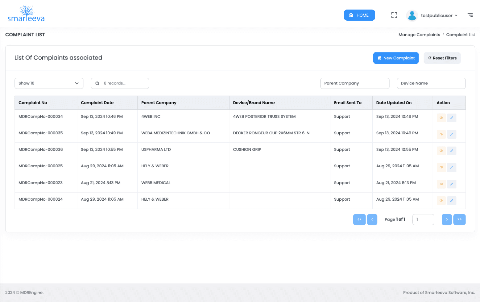
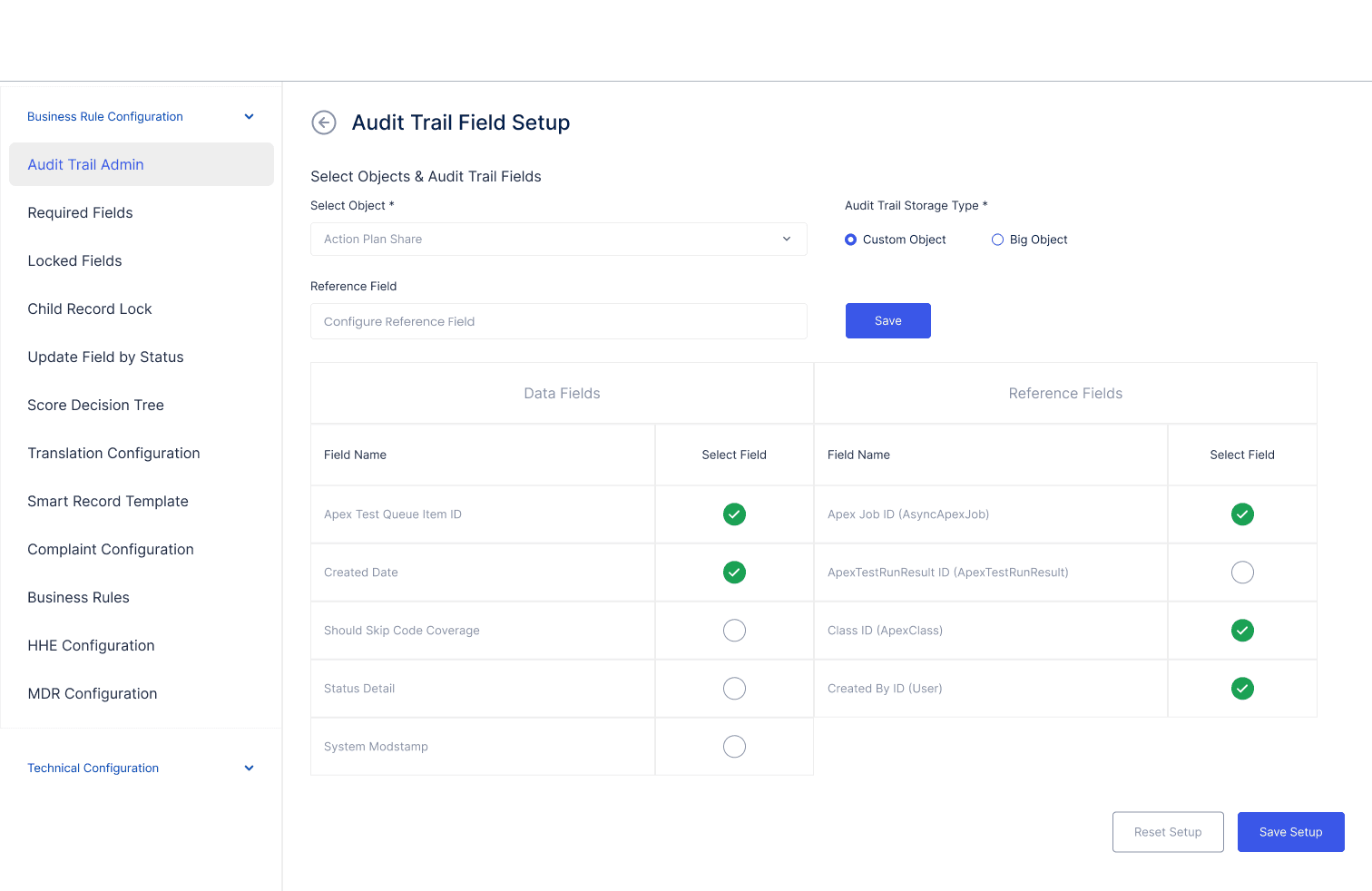
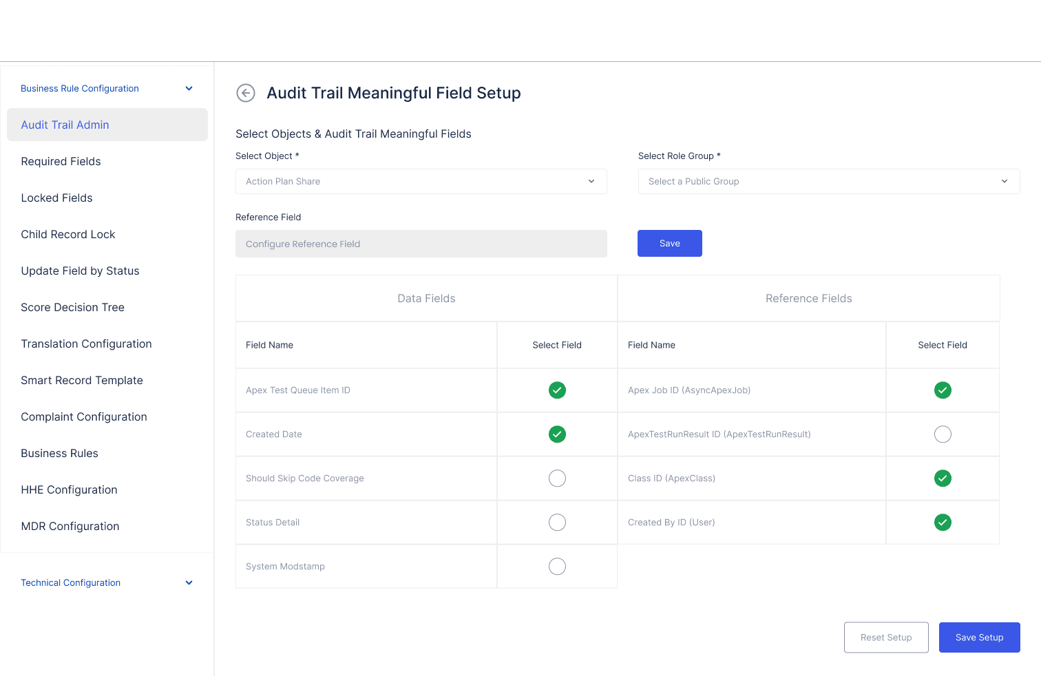
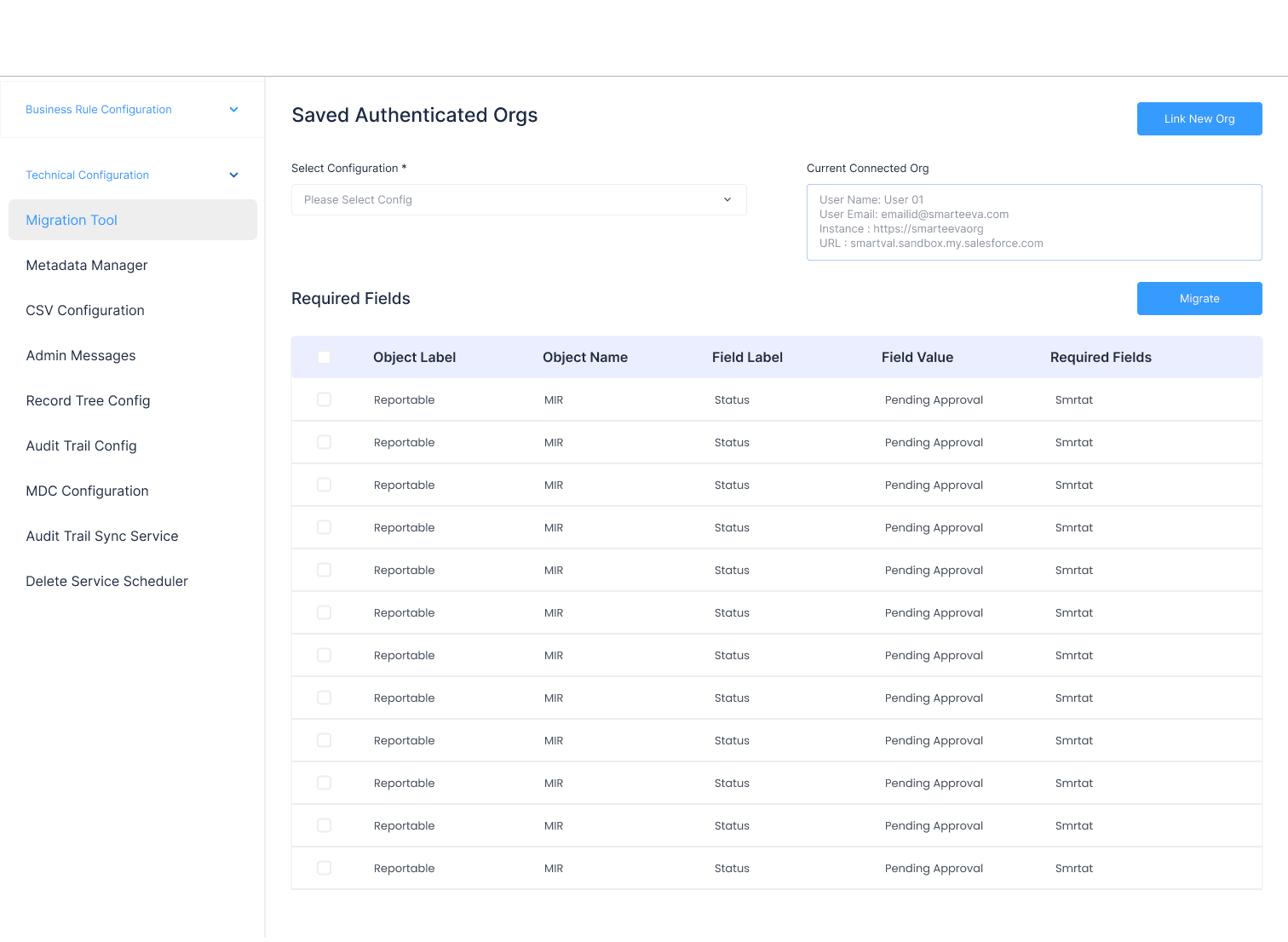
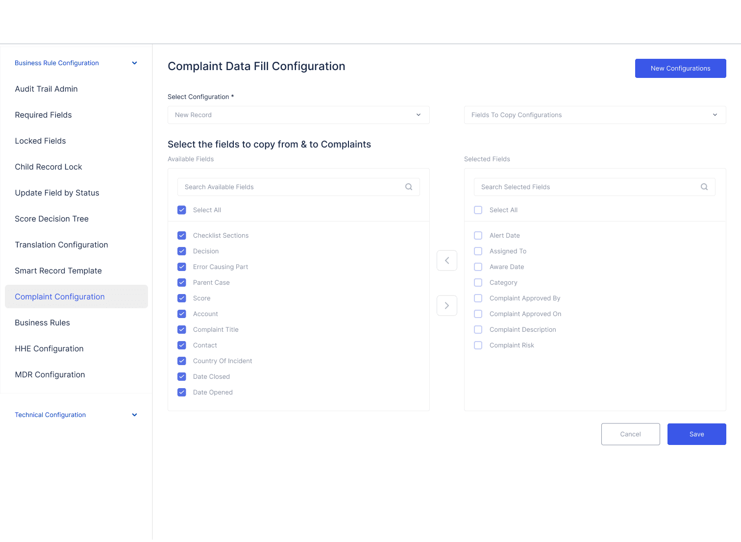
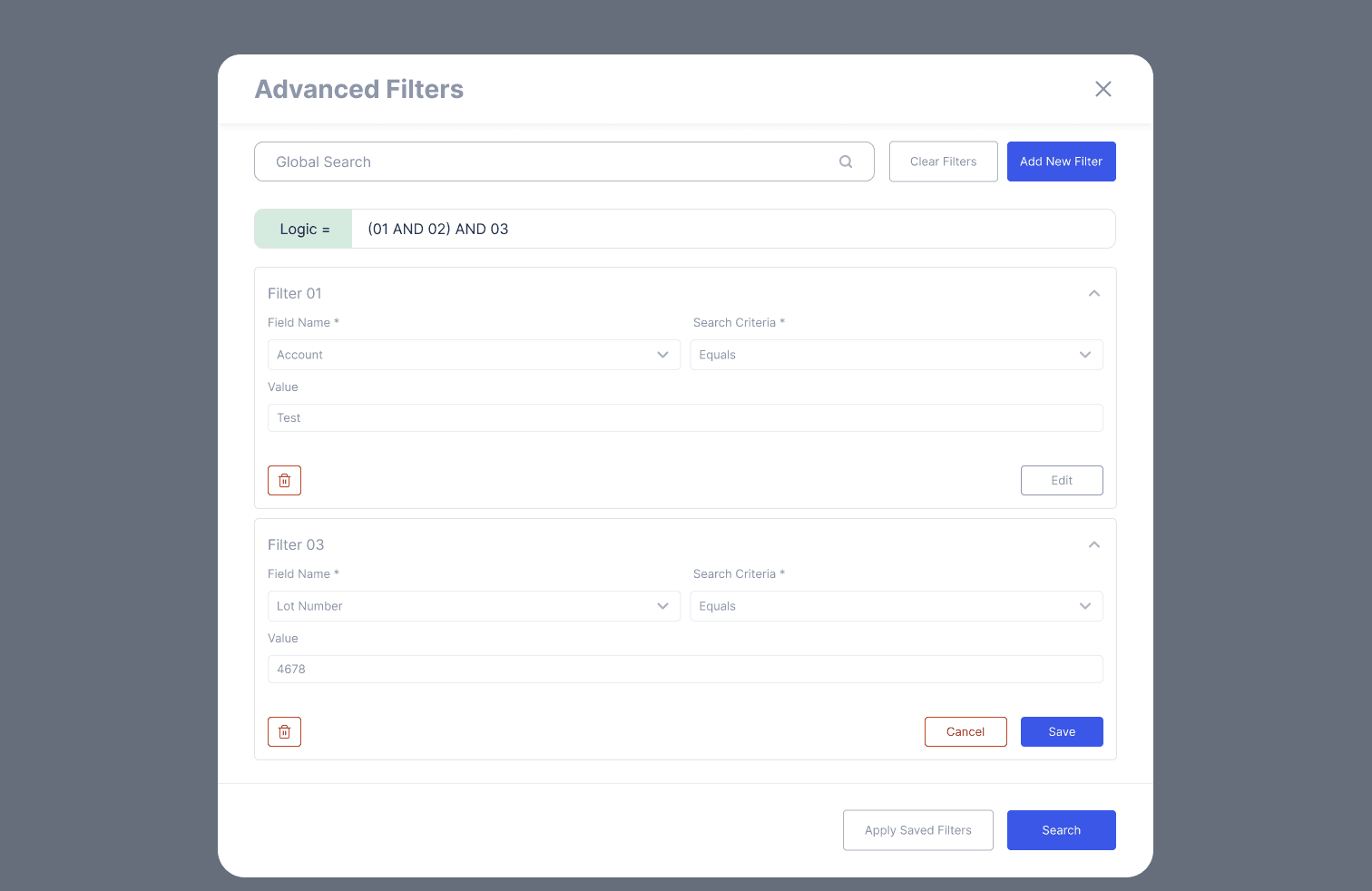
3. Data Management Screens
Companies
Users
Complaints
MDR submissions
Billing & subscriptions
Clean tables, bulk actions, filters, and consistent row patterns.
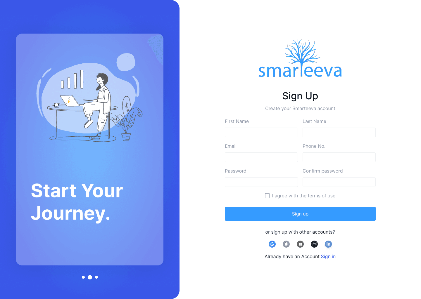
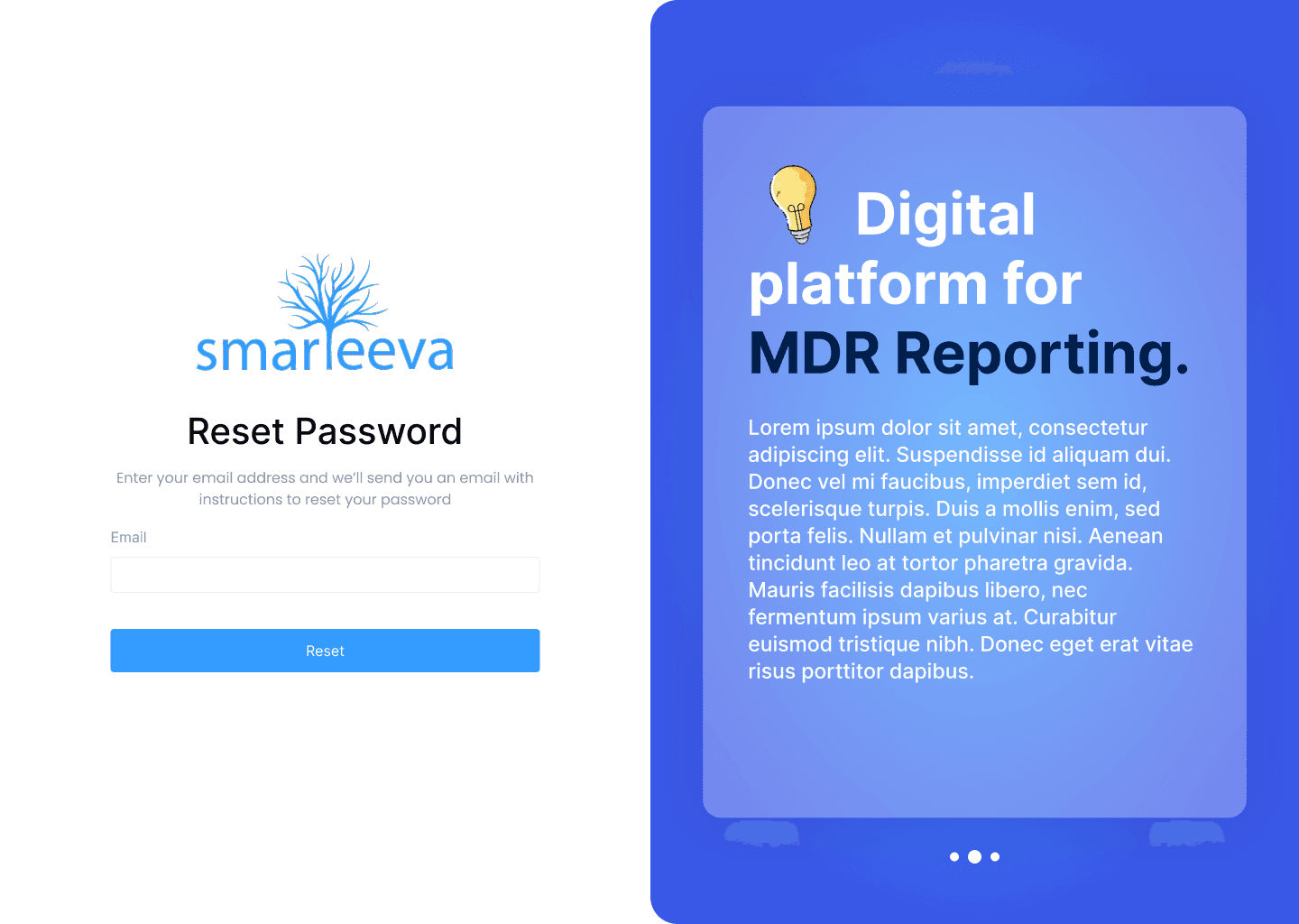
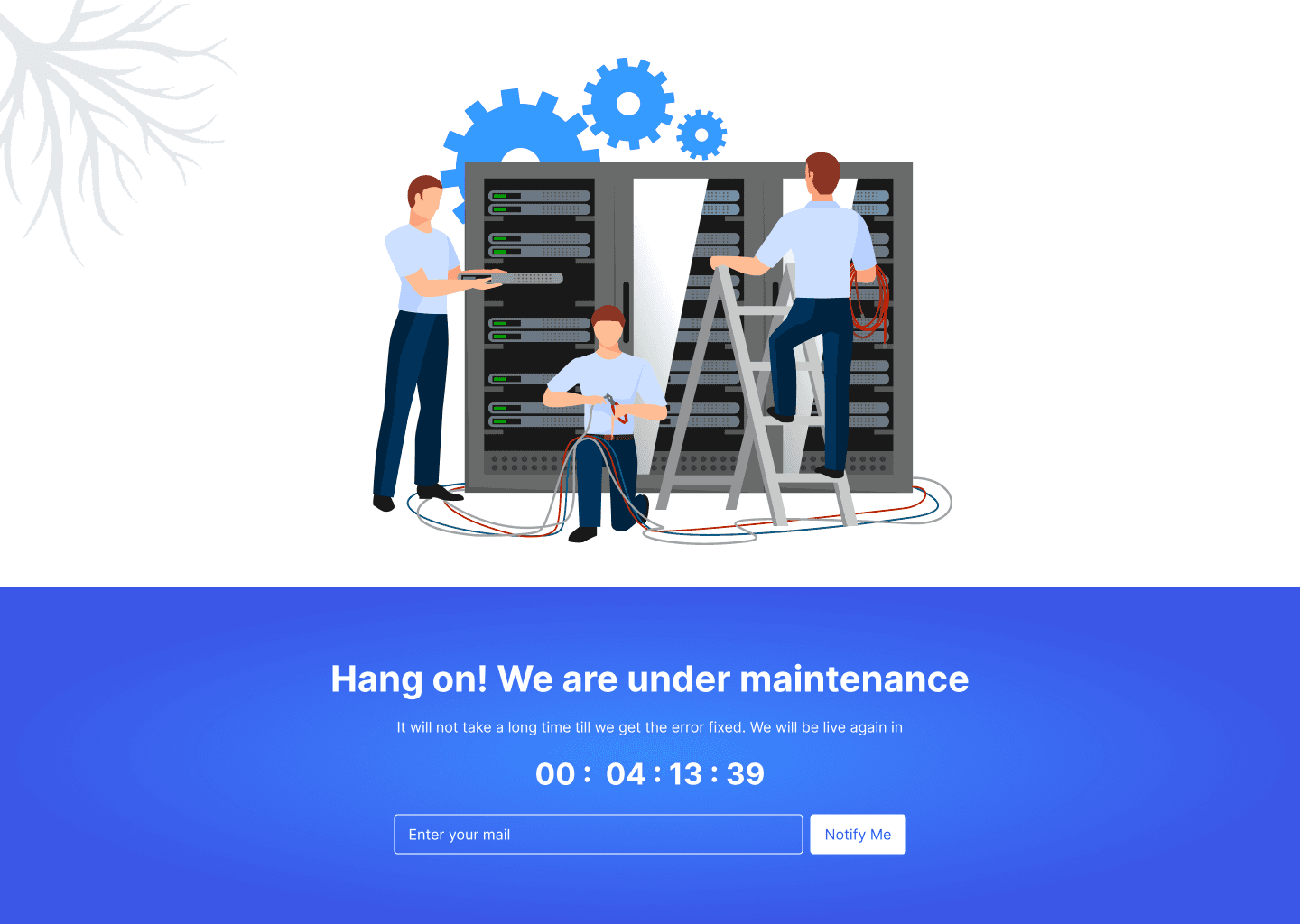
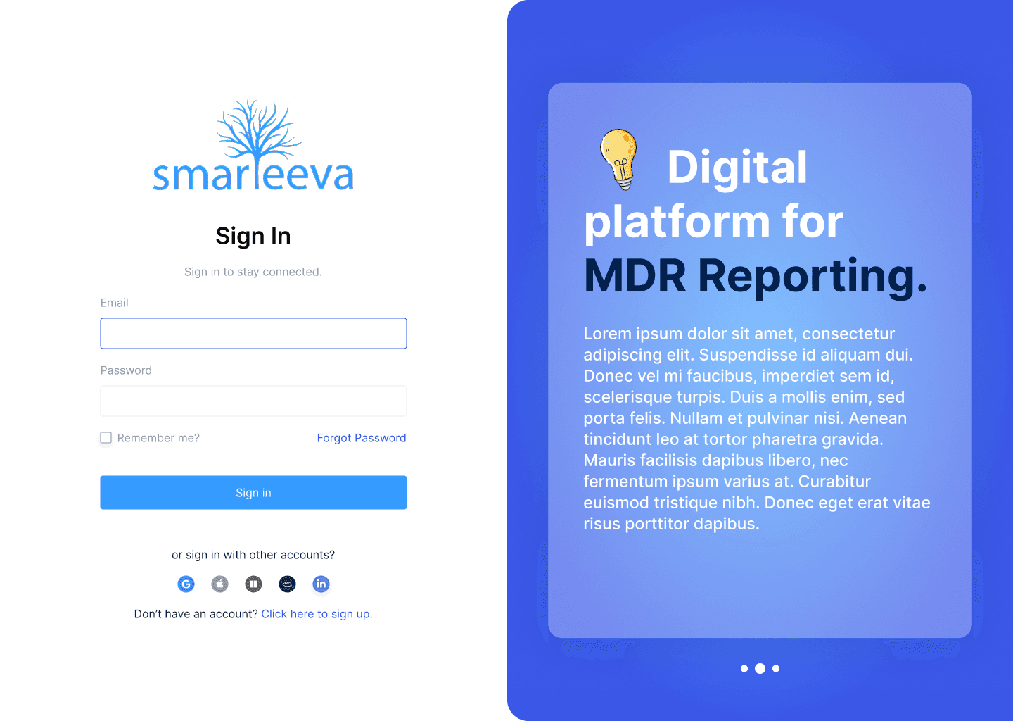
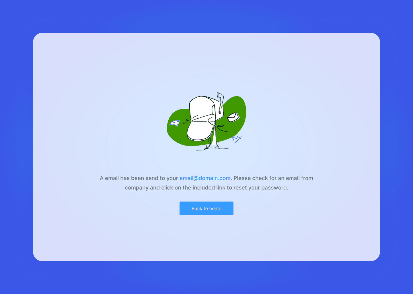
4. System Pages
Login
Signup
404 / 500 error pages
Maintenance state
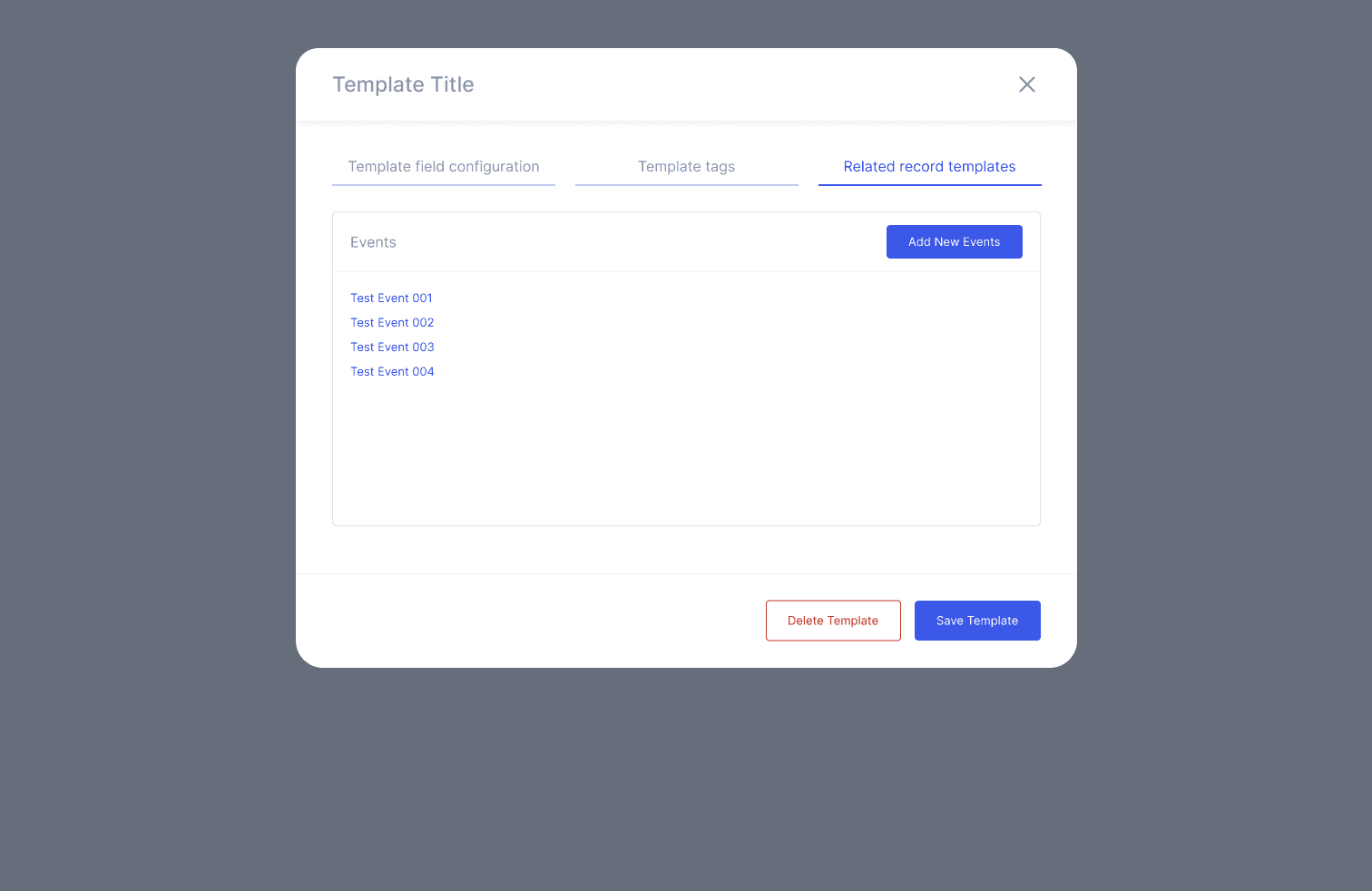
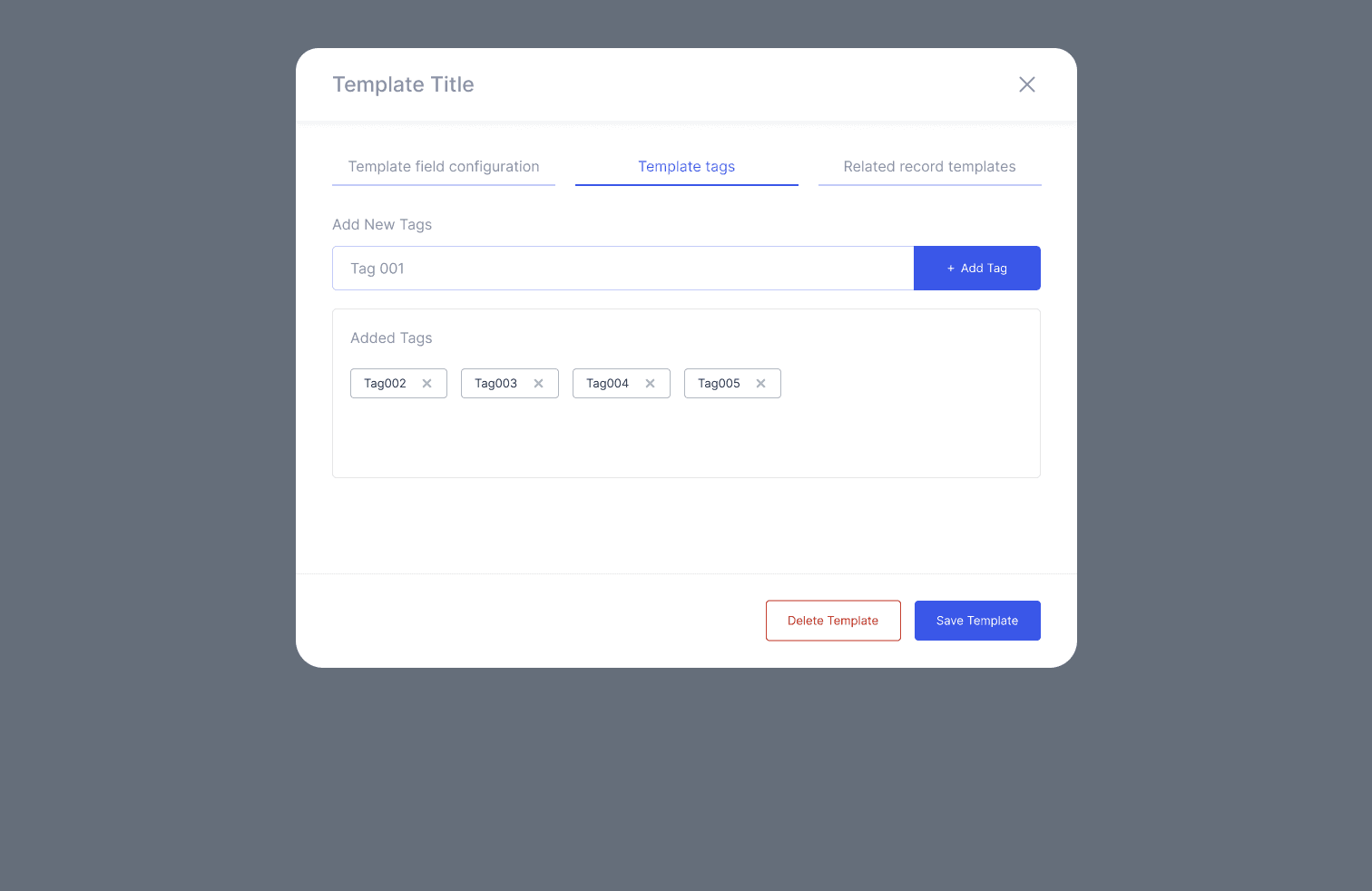
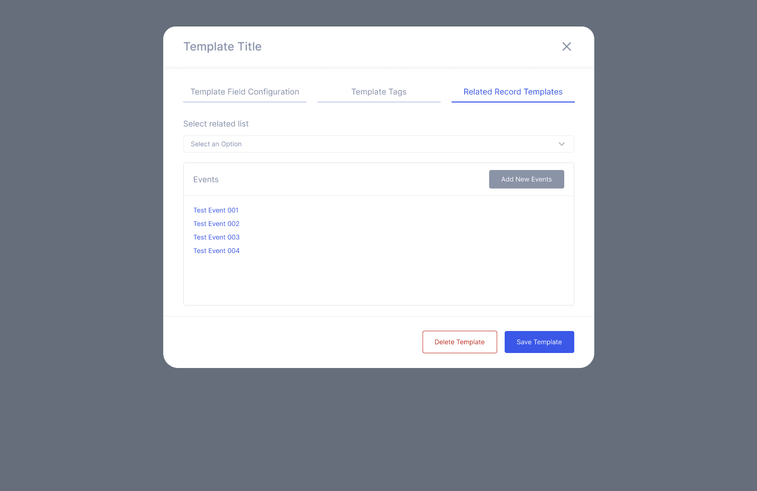
5. Internal Design System
Modular components (tables, cards, forms, dialogs)
Unified color tokens
Layout grids & spacing rules
Typography scale
Standardized icons & system actions
Process
1. UX Audit
Reviewed 60+ screens
Mapped inconsistencies
Identified high-friction workflows
Analyzed navigation depth and redundancy
2. Information Architecture
Consolidated multiple menu levels
Grouped related modules
Reduced clicks for top workflows
Improved breadcrumb and wayfinding
3. Dashboard Layout
Replaced dense data tables with clear analytic blocks
Added bar charts, donut charts, heatmaps
Prioritized actionable insights
4. High Fidelity UI
Clean enterprise layout system
Clear spacing and typography hierarchy
Updated table interaction model (view/edit/delete)
Reduced visual noise and unnecessary modals
5. Component Library
Created internal UI system for all future tools
Standardized states: empty, loading, error, zero-state
Unified button patterns and table actions
6. Implementation Support
Delivered full specs, redlines, and behavior rules
Provided examples for extreme data cases
Supported engineering handoff & QA
Impact
Quantitative
Admin task time reduced 40–50%
Navigation time reduced ~30%
UI consistency dramatically improved
Internal support escalations decreased significantly
Qualitative
“Feels modern and cohesive now.”
“Much easier to onboard new internal users.”
“We can find data much faster.”
Challenges
Redesigning complex data tables without overwhelming users
Aligning multiple teams with different UI expectations
Ensuring new patterns worked with legacy Salesforce-driven data models
Making charts readable in real-world noisy datasets
Reflection
This project unified Smarteeva’s fragmented internal tools into a cohesive enterprise admin experience. It strengthened my ability to:
Perform large-scale UX audits
Design systems that balance clarity with power
Redesign complex data-heavy interfaces
Create scalable foundations for future AI integrations
The Admin Portal redesign became the foundation for all internal productivity tools at Smarteeva.
Flowchart

Screens
System Pages